


Inside Casa Larga's 250th anniversary label
How the 1776 to 2026 edition came together.

Jhonny · Illustrator
· 5 min read
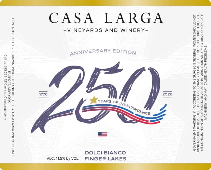
Casa Larga is a family-owned winery and vineyard in Fairport, New York, founded in 1974 and known for award-winning wines and authentic ice wines. We've worked with them on advertising and on their website. In 2026, the year the United States marks 250 years since 1776, their Dolci Bianco carries an anniversary edition label.
A label like this has to mark the occasion without turning the bottle into something else. These are the choices that shaped it.
Keep the house
The top of the label stays the winery's own: the Casa Larga name in widely spaced capitals, with Vineyards and Winery beneath it, where a regular customer expects to find it. An anniversary edition is still a Casa Larga bottle first, and a loyal customer should recognize it before reading a word. Change the name block and the people most likely to buy it have a harder time spotting it on the shelf.
Give the occasion one big idea
The anniversary lives in a single element: a large, hand-lettered 250 that fills the middle of the label, with Anniversary Edition set in a small arc above it. One big idea reads from across a store. Five small ones read as clutter.
Drawing the number by hand, instead of setting it in type, gives it movement and warmth, a better fit for a celebration than a formal, engraved look.
The background stays quiet too: a faint pattern of stars and small 250s that only appears when you look closely.
Let the dates frame it
The years 1776 and 2026 sit on either side of the numerals, so the span reads at a glance. Setting the dates inside the design, rather than in a line of small print, makes them part of the picture. A red, white and blue ribbon sweeps through the 250 with Years of Independence along it, starting from a small gold star, and a small flag sits just below.
Everything that says “anniversary” is gathered in that one central block. The rest of the label stays calm, white and edged in gold.
Keep the shelf basics where they belong
Dolci Bianco and Finger Lakes stay at the bottom, where shoppers look for the wine's name and region, with the alcohol content beside them. The side panels carry what every wine label has to carry: the sulfites notice, where the wine was grown, produced and bottled, and the government warning. A special edition doesn't get to skip any of it, so the design works around it instead of fighting it.
Check it at three distances
A label gets seen from across the aisle, in someone's hand and on a phone screen when the bottle shows up in a post. Each distance needs something different.
- Across the aisle: the 250 and the Casa Larga name are what carry.
- In the hand: the dates, the ribbon and the wine's name reward a closer look.
- On a screen: the whole label still reads as one clear image.
Check every label at all three distances before it goes to print. More on our packaging work.